Blog Details
Art Tuesday Black and White Warriors
February 03, 2015
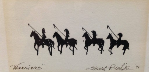
It’s Art Tuesday at Elarbee Media! This week we have chosen to highlight a black and white titled “Warriors”. This piece, circa 1971 by Stuart White, is only 3 X 5 unframed but the impact is so much larger.
The stark contrast of the heavy black ink on the white paper (now slightly yellowed) is powerful, and reminiscent of a Rorschach Test. Its simplicity begs the question – “When is less actually more?”
In advertising, we forget that simplicity sells. Ads are crammed with disclaimers, arrows, details and numbers; so much so that it can be hard to figure out what is being offered. Is the answer, clean, simple, stark but solid presentation as in “Warriors”. I think it is certainly worth a test.


