Blog Details
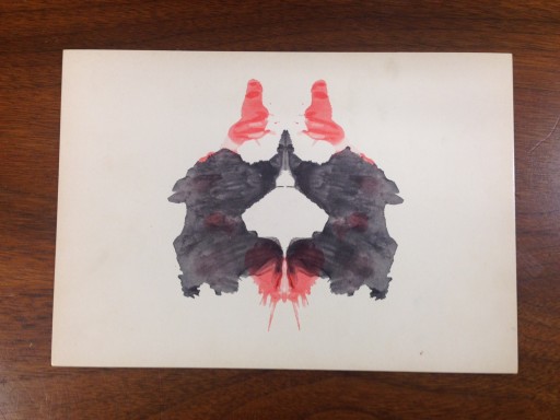
Imagery Should Enhance Not Confuse the Message - Rorschach Plate II
May 11, 2015
Monday’s at The Specialist Works US are hectic days where we each wear many hats. That can get confusing. There is nothing that adds clarity like a glimpse at a Rorschach plate (or perhaps not). Here is Plate 2 in the series. What do you see?
Adding clarity to an advertising message with imagery seems to be a lost art. Conversely, adding confusion to an advertising message with imagery is a prolific concept. How much value is there in the image versus the content, and what happens when they fail to work together?


