Tag View: Power of Imagery
The Power of Imagery – Rorschach Plate IV
Power of Imagery - Rorschach Plate VIII
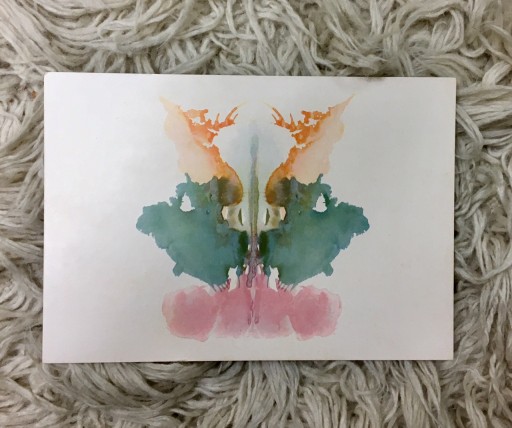
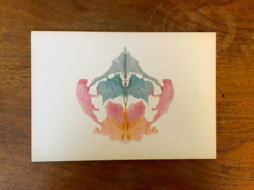
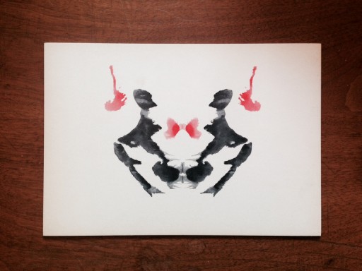
Unusual in our exploration of Rorschach Slides to date, Plate VIII has significant amounts of color – soft pastel colors. While we have seen bold and meaningful reds, in slides 1 to 7, this is the first slide that completely rejects the black and white. Why?
Does the power of color extend to pastels? Do we react to soft colors with the same gravity and passion ignited by the more stark black, white and red? Does it mean something less to us for its softness? Is there welcome and comfort where there may have been power in a different color choice?
Whichever side of the debate you fall on, it is clear that color has an impact. It changes not only the message, but also the openness of the recipient. Positioning advertising messages with the appropriate colors for both the audience itself AND the desired audience interaction is crucial.
Power of Imagery - Rorschach Plate VII
In a segment The Specialist Works US calls the Power of Imagery we look at Rorschach slides to inspire our conversation on advertising images and layout elements. This week's Plate VII, though evocative, is sparse in its color and its presence.
Is less more? In this case it likely is. Do advertisers take on too much in a single full page ad? Is the suggestion more powerful than the disclosure?
Subtle vs. Blatant. Weigh in. We'd love to hear from you.
Power of Imagery - Rorschach Plate VI
In our Power of Imagery segment we have been posting images of our Rorschach plates. We have a beautiful vintage collection here in the office.
in print advertising, there is little that is more important than an image. Ad copy is important, messaging is crucial, but you have to get the attention of the consumer before you can try to sell them the product.
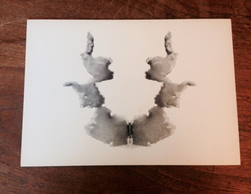
Plate VI in the Rorschach test is an attention grabber. Black and white with one strong central image, It would make a great ad layout with all of the white space.
Power of Imagery - Rorschach Plate V
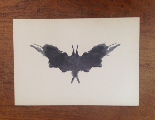
In our segment the Power of Imagery, we explore the impact of pictures on ourselves as consumers and individuals. This image is of the Rorschach Plate V, commonly known as the "Bat"
How much of traditional imagery is also laced with symbolism that we don't credit when first viewing an image, and does it really matter?. "Bats are symbols of rebirth - the facing of fears and being reborn." Do I really recognize that in any form when viewing the image?
To some degree when the symbolism of images is pervasive in a culture we do add that into the mix, but fringe or subtle suggestions may not translate.
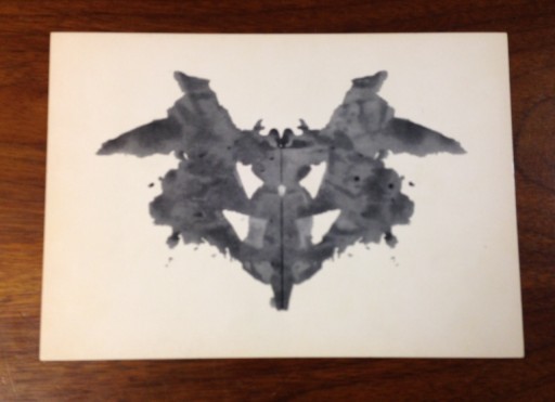
The Power of Images - Rorschach Plate IV
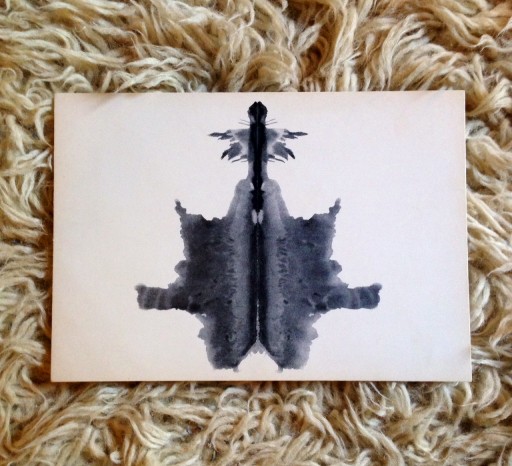
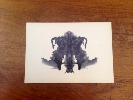
These Rorschach slides were originally produced in 1921. The inkblots are a projective test using “bilaterally symmetrical inkblots”. What you see in the inkblot is expressive of your personality. The fact that not everyone sees the same thing is essential to the test. As with art, these inkblots evoke responses based on what we bring to the table. They are not fixed or finite. They are reflections of who we are when we look at them. What does that have to do with advertising? Everything.
Evoking emotion with an image can create either a bond or a revulsion. Always test the impact if imagery on your target audience before rolling it out into the marketplace. It is often surprising that what seems innocuous to one person stirs deep emotion in others. We all have our own lens created by the lives we have led. Whether we are viewing the images through our baggage or our hopes, we always see them through a filter. Look at your customer to determine what they are likely to see and test first.
The Power of Imagery - Rorschach Plate III
In our continued exploration of the power of Imagery, we are on Rorschach
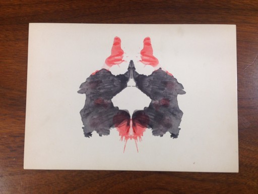
Plate III. Black, white and red the plate is sparing in color, but not so in impact. The addition of the red to the image is both jarring and powerful, if not extremely evocative.
In newspaper advertising, red is often the selected "Spot Color" chosen to give pop to an otherwise plain black and white ad. It is an eye-catcher on an otherwise "flat" page.
Red does draw attention. It is a powerful color that needs to be used wisely, but not necessarily sparingly.
Imagery Should Enhance Not Confuse the Message - Rorschach Plate II
Monday’s at The Specialist Works US are hectic days where we each wear many hats. That can get confusing. There is nothing that adds clarity like a glimpse at a Rorschach plate (or perhaps not). Here is Plate 2 in the series. What do you see?
Adding clarity to an advertising message with imagery seems to be a lost art. Conversely, adding confusion to an advertising message with imagery is a prolific concept. How much value is there in the image versus the content, and what happens when they fail to work together?
Throwback Thursday - Hanes Goes Brainy
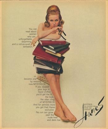
It is Throwback Thursday at Elarbee Media. We happened across this vintage Hanes ad that we just love. A woman who reads books, a woman who wears glasses, a woman who is attractive and overtly sexual, and all of this is an ad to sell product to women. It is not demeaning, but it is SEXY. The imagery is superb, and the clean background allows the content to skim the body of the image to ad interest.
If you are not a fan of redheads, this ad campaign also features a brunette version and a blond.
The Impact of Visual Imagery - Rorschach Plate I
One of the most interesting things about print advertising is the impact of the visual on the person viewing it. We don't all see the same things in an image, so it can be difficult to determine in advance how ad images will play out in the marketplace. Sometimes results are surprising as is the power or people's reactions.
The Specialist Works US, oddly enough, has a set of vintage Rorschach Test cards that speak to this very subject. If you don't know what you are looking at you may mistake them for art!
Here is Plate 1. Lets us know what you see.
Throwback Thursday Smirnoff Circa 2000
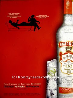
It is Throwback Thursday at Elarbee Media. Here is a more recent throw back ad from Smirnoff Vodka circa 2000.
Why so modern you ask? This ad incorporates three of our favorite ad elements: Red, clean imagery and humor.
Art Tuesday Trees without Leaves
It's Art Tuesday at Elarbee Media. This painting on board is one of many we have in the office of trees without their leaves. In fact we walked around and counted four of them. One is an oil, two are acrylics and one is a pastel. Do we keep buying the same thing because the imagery resonates with us? Perhaps.In advertising, is that also what compels us to buy? Imagery is a powerful tool in motivating emotionally driven decisions, but it can also impact your choice of laundry detergent.What imagery has recently made you consider making a purchase? Was it a product you didn't really need? Share with us!
Throwback Thursday American Tourister Ad is Crush-Proof
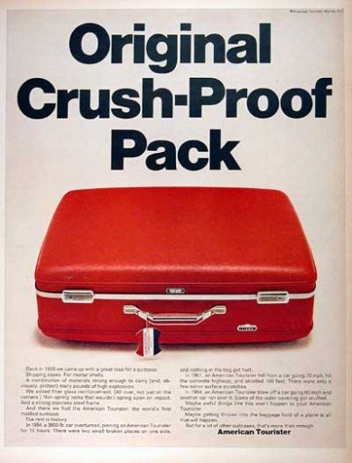
It's Throwback Thursday at Elarbee Media. This 1968 American Tourister ad is the perfect example of clean simplicity with its use of color and graphic imagery. We love it!
They are selling a SUITCASE, and the functionality and features of......a SUITCASE. Shocking but true! Selling the benefits of a product actually works.


