Tag View: Throwback Thursday
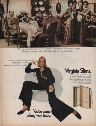
Throwback Thursday - You've Come a Long Way Baby
It is Throwback Thursday at TSWUS, and we are highlighting a vintage Virginia Slims ad in honor of our Womens Network Series Spring Session today. While attitudes about smoking have changed dramatically, these ads still resonate. In a large part, this series is about everything but the product. Embracing the idea that glass ceilings no longer exist for women, (especially at TSW) is embodied in the story told in this series. What was it like historically, where are we today, and whats next are all focused in very limited copy, and heavy imagery. The ads project positive movement to a more opportunity rich future for women. The enthusiasm behind the idea leads to the product being embraced as a symbol of that momentum. Is this about cigarettes? Yep. Is it an amazing brand campaign that still resonates today? Yep. "You've come a long way baby."
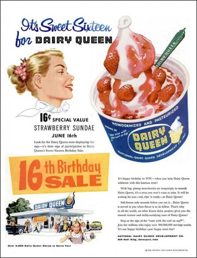
Throwback Thursday - Dairy Queen
The first Dairy Queen logo was simply the company wordmark on a blue background. Signs at DQ locations also added an image of their signature soft-serve cone. Both can be seen in this image and it is even said for customers to stop at the sign of the cone with the curl on top. This ad embodies the 1950s vibe because lets be honest, ice cream and milkshakes were huge. It is also apparent that Dairy Queen was effective in this approach because today there are more than 6,400 stores in more than 25 countries.
Turkey Day Approaches
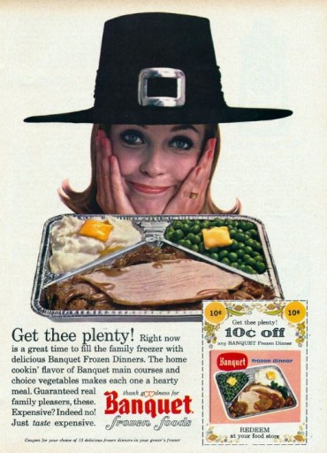
Can you imagine setting the table with these little beauties instead? A few minutes in the oven and 'PRESTO!" dinner is served. OK, ok, Grandma will look at you funny, and you probably wont be asked to host Thanksgiving again, but it will be a Year To Remember!
Banquet gives us options. The advertisement show us exactly what those options are. We at The Specialist Works like to show you how to use your available options in a new way.
Maybe this is the year - TV Dinners for Everyone!
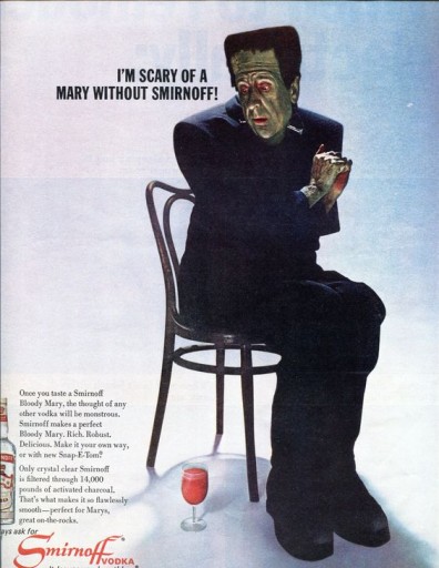
Throwback Thursday: Spooky Scary Smirnoff
Wit usually comes from the combination of two pieces of information that don't immediately seem to be related. In this ad, Smirnoff uses the trend of drinking Bloody Marys in the spirit of Halloween to relate to their audience. Smirnoff also creates interest by flipping our immediate thoughts about monsters; showing Frankenstein sitting at the edge of the chair in fear of the drink underneath; a scared-y monster. By taking the context of an old idea; flipping it; combining it with a trend; and relating it all to their product, Smirnoff creates a humorous, light-hearted advertisement that easily sticks with the consumer.
I know what were having for Cocktail Friday!
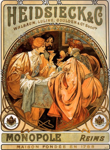
60's Art Nouveau
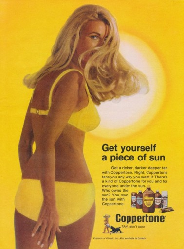
THROWBACK THURSDAY - A PIECE OF THE SUN
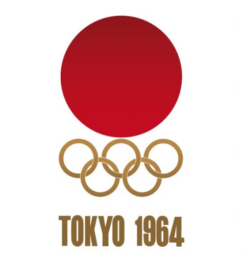
Throwback Thursday - Japan 1964
The Olympics are a global marketing phenomenon, with billions around the world tuning in to share in the spectacle. Nowadays regulations on who can advertise and promote their brand using Olympic buzz have prevented many marketers from being as involved in the games as they previously were - you can thank Coke and Atlanta 1996 for that, as AdWeek writes here. But today we'd like to highlight simpler times. The 1964 Games in Tokyo held a lot of significance, marking the first time the games were held in Asia, were televised internationally, and ran alongside the Paralympics Games. The logo gorgeously unites simplicity, color, and symbolism. Japan is often referred to as the "the Land of the Rising Sun", and the art perfectly embodies this, with a bold red supernova literally rising out on top of the rings. We love the stylistic choices and the design overall. Good luck to all those in Rio!
Throwback Thursday - Dr. Pepper
This ad very closely mirrors the marketing philosophy that we practice at TSW US. Through brand-response, our ads both push product and bolster brand image. The art reminds us of the Dos Equis Most Interesting Man in the World, and the copy is akin to a buddy nagging you on to do something exciting in a crowded cafeteria. The bold imagery, clever copy, and clean execution almost has us reconsidering our allegiance to Coke. Almost.
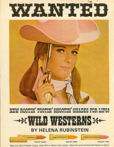
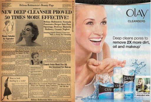
Throwback Thursday - Helena Rubinstein
We love how classic and lively the product names are. Bright and straight to the point, they allow her to match a color to today’s mood, outfit, or event. Encouraging customers to build their own emotional associations with a product increases brand loyalty and incentivizes purchases of different offers. Tootin’ Honey may be as sweet as a peach, but Shootin’ Pink will leave you blushing.
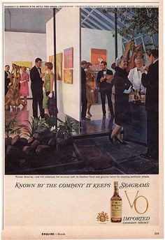
Throwback Thursday - Cocktail Party
If you joined us last night, consider yourself hip. The Specialist Works US is as the ad says" Known by the Company it Keeps" , and we are thrilled with who that encompasses.
Cheers Friends!
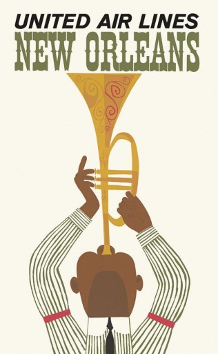
Throwback Thursday - United Airlines and New Orleans
Destination envy may be the emotional trigger to call someone to action to book a trip, but is the strength of the messaging for United sufficient to make the connection? I want to go to New Orleans, but do I want to go there on United? While we normally embrace the clean format of ads, we think this may be a miss.
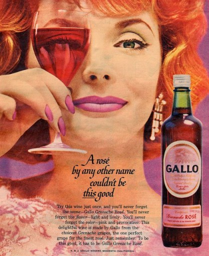
Throwback Thursday - Gallo Rose
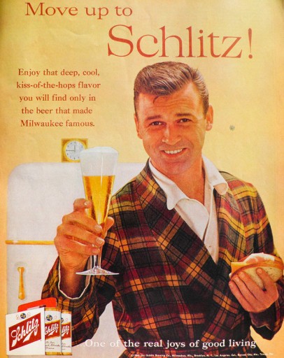
Throwback Thursday - Ham and Cheese and Schlitz
Making your product feel special in an ad helps encourage people to buy it. "That guy had an ice cold Schlitz in his pajamas, I want that life." It may see simplistic, but how many of us would be happy with a cold beer and a ham sandwich while in our PJ's? Sign us up - we love this ad!
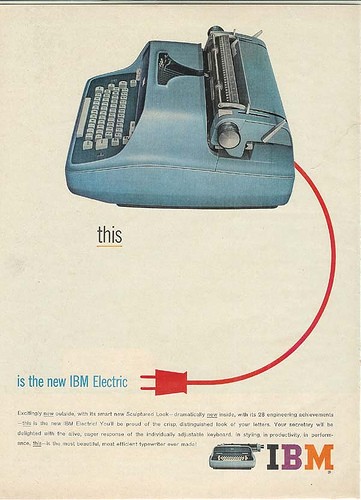
Throwback Thursday IBM Electric
It is Throwback Thursday at Elarbee Media and we thought we would highlight a breakthrough in technology. The electric typewriter. We saw this ad, and though immediatley that it was different. Why? Well, it does two things. It highlights new technology, but it also combines two mediums - photography and graphics. The graphics aren't only surrounding the photo, they are becoming part of it through extension.
When you first see the image, it looks like a photo, but the flatness of the red extension cord pulls you back in. The layout is clean and simple, and the trickery of the combined photo plus graphic makes you do a double take. CLEVER! The color choices are also compelling. We like it. (Not enough to buy an electric typewriter though)
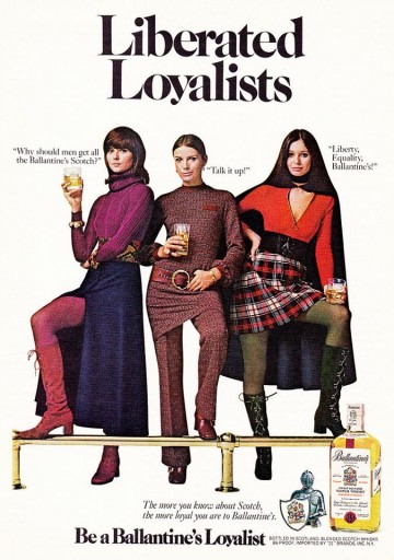
Throwback Thursday - Liberated Loyalists
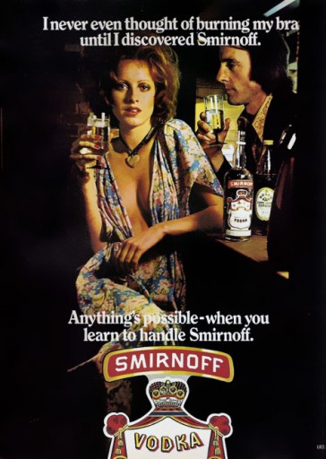
It is Throwback Thursday at Elarbee Media and this week's ad shows the political environment bleeding over into advertising messaging. This 1970's ad focused on feminism highlights the tone of the times, but it also does something else. It encourages women to consider themselves scotch drinkers.
When you add another 50% of the population into your target customer base, it can be a game changer. Does the nod to the "fairer sex" translate to higher sales volumes? Or is it money down the drain trying to chase a customer base that doesn't look like your current profile?
There is only one way to find out. Test! What we can guarantee is that if you rely on the same old strategy year over year, you will surely lose out on growth.
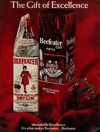
Throwback Thursday -Christmas Box Convenience
It is Throwback Thursday at Elarbee Media and we are in a Holiday mood. What says "Holiday" more than a bottle of gin?
A bottle of gin in a holiday gift box.
The idea of pre-wrapping a gift to give is pure marketing genius. Allowing last minute buyers to buy a holiday gift that comes wrapped and ready to hand over adds the convenience factor that harried shoppers desperately need.
Packaging can make the difference in sales volume, especially in the holiday season. Consumers want to look organized, efficient and engaged in the holiday. They do not, however, want to have to commit the time. Sell convenience.
Throwback Thursday Office Party
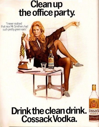
It is Throwback Thursday at Elarbee Media, and here is a classic offering from a different era in office parties.
What great imagery. We love the humor.
Tombstones for Media RIP Bow & Arrow Hunting
R.I.P Bow & Arrow Hunting . As part of our segment Tombstones for Media, we highlight popular media that are ceasing distribution. We offer replacement suggestions that target either the same demographic, or the same geographic footprint as the publication that is being buried. Bow & Arrow Hunting will cease publication for 2016.
As a replacement option, we recommend: Eastmans' Bowhunting Journal, Bowhunting World, or Petersen's Bowhunting.
Throwback Thursday Reddi-Wip and Jello-o
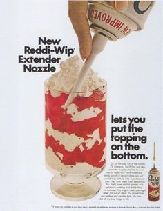
It is Throwback Thursday at Elarbee Media and today we are highlighting a vintage ad for Reddi-Wip. You know it is old because it features Jell-o. We still love it! Plenty of white space, and a strong central image with red as the feature color makes this right up our alley.
We can't help but think that the ad copy translates into today's lexicon as much dicier than it was intended in the 70's. That is why reviewing old ads is so much fun.
Throwback Thursday Monster Cereals
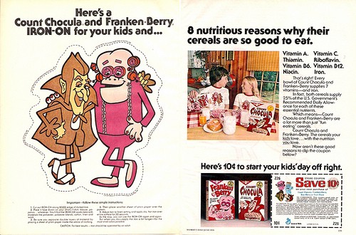
It is Throwback Thursday at Elarbee Media and in honor of Halloween, we thought we would highlight this vintage Monster Cereals ad. This one has Franken-Berry and Count Chocula. From 1976, this offer not only gives you a free iron on decal for your t-shirt so you can advertise the product for them, it also has a 10 cent coupon.
Brilliant! They don't even have to pay for the t-shirt, just the decal. (And you know we all used them)
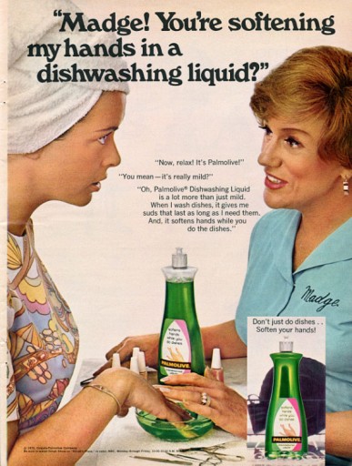
Throwback Thursday Madge for Palmolive
It is Throwback Thursday at Elarbee Media, and today we have brought back Madge. In this long running campaign for Palmolive dish-washing liquid there is no celebrity spokesperson. There is a created character. Similar to the Flo of Progressive ads of today, the advertising character becomes an icon through repeated viewing.
The "everyday" character of these women makes them believable. They are not slick. They are working class people, This gives them a comfortable feel to the reader or viewer, allowing you to get the message across effectively.
Madge is not an aspirational image. She is your next door neighbor or close friend, and therefore can be trusted to deliver you an advertising message that must be true.
Two thumbs up. Plus we love the uniform with the embroidered name on it,
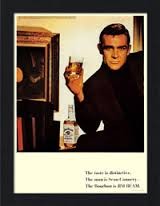
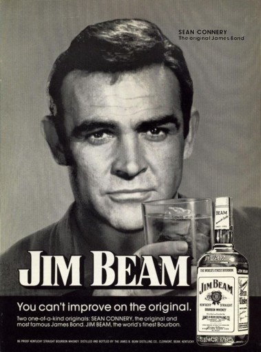
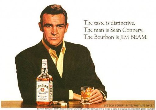
Throwback Thursday Sean Connery for Jim Beam
It is Throwback Thursday at Elarbee Media, and true to form, we are featuring a vintage print ad. We pick ads from the past that we rate as timeless or that are extremely timely to a period and no longer have relevance, but are very amusing. Today we are feeling timeless.
Today, we selected one of our favorite celebrity endorsements to highlight. Sean Connery for Jim Beam. This ad hits on all levels and if we put Sean Connery's updated photo with a beard in the same ad today it would sell many fifths during the holiday season.
Simple and clean. Image-heavy with limited copy. Definitely aspirational.
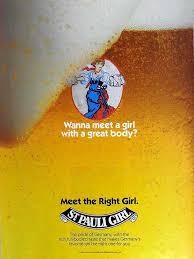
Throwback Thursday Oktoberfest St. Pauli Girl
In honor of Oktoberfest, we thought we would use Throwback Thursday to highlight some beer ads. This St. Pauli Girl ad is from 1990.
Simple, but witty. Creating a woman out of the beer is brilliant, and allows the consumer to indulge in a romance with the product. Silly and cunning all at the same time. We love it. The fact that the art execution is also clean and well done is a fine by us too.
Prost!
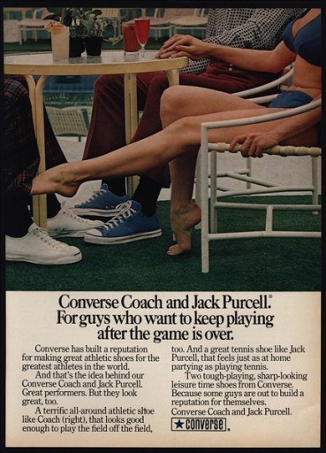
Throwback Thursday Converse Shoes
It is throwback Thursday at Elarbee Media, and today we are going to pick on one of our favorite classic brands, Converse.
We love the ad copy headline, we love the heavy image, light copy layout. We think the ad overall is funny.
But what is up with the black socks with bright blue shoes? And the white shoes with dark plaid pants? Odd that it is so close to great, and yet fails.
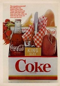
Throwback Thursday Labor Day Picnic Coke
It is Throwback Thursday at Elarbee Media and we are getting ready for the Labor Day weekend. We thought we would highlight a great American tradition - the Labor Day Picnic.
In this 1966 print ad from Coca-Cola,the picnic is compacted into the 6 pack carrier for the bottles. Clever.
The Americana, the picnic vibe and the product itself are all captured without a lifestyle scene. Simple and ahead of its time, this ad works for us.
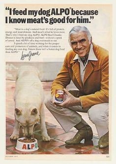
Throwback Thursday Lorne Greene for Alpo
In honor of National Dog Day we thought we would highlight this 1970's Alpo ad in our Throwback Thursday post. This ad is a classic celebrity product endorsement all the way down to the signature at the bottom of the copy.
We can't help but believe that the snazzy shirt collars helped push this product as well. Lorne Greene looks every bit the part of the dapper dog owner of the era.
Happy National Dog Day from Elarbee Media!
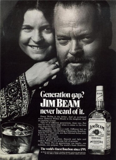
Throwback Thursday Orson Welles on Generation Gaps
It is Throwback Thursday at Elarbee Media and we thought we would follow up or Orwell post of yesterday with a vintage Orson Welles ad for today.
From 1972, this ad speaks to the political an cultural climate of the times. All things old were "stodgy". But if you are a brand with a proud heritage, how do you combat that? Celebrity endorsement combined with generational understanding - If you are Jim Beam.
We are personally happy to report that Jim Beam weathered the storm, and is still alive and kicking. Was it is because they chose one of our favorite actors to endorse their brand? Perhaps it was because they saw a need to stay relevant and acted on it in their messaging. Just maybe it is because the product quality speaks for itself, and will maintain a following through tough times by combining quality with a strong price point.
Whatever the truth is, we love looking at Orson Welles. Good job Jim Beam!
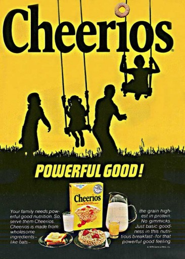
Throwback Thursday Cheerios Ad is Powerful Good
It is Throwback Thursday at Elarbee Media and we are in Back to School mode, so we thought we would highlight this 1978 ad for Cheerios cereal.
The color is eye-catching, and reinforces the brand's merchandising. There is a just enough "white-space" which in this case is yellow, and the ad copy is minimal.
The black on yellow family silhouette is a bold graphic that reinforces the wholesome image Cheerios still clings to today.
The ad pops. Cheers Cheerios this ad is "Powerful Good".
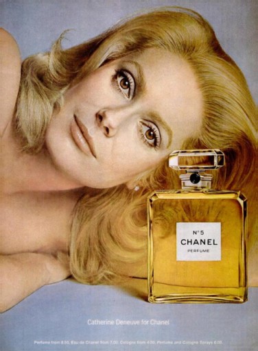
Throwback Thursday Chanel No 5
It is Throwback Thursday at Elarbee Media and we want to highlight this 1972 perfume ad from Chanel. It is so simple and elegant it could almost be from any era. In comparison to other ads of the period, it seems so subtle. That is the reserve that Chanel has employed so consistently to maintain brand integrity.
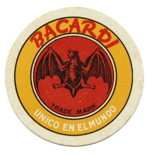
Throwback Thursday Bacardi Point of Sale
It is Throwback Thursday at Elarbee Media and this week we are all about bats. We love this Bacardi Bat coaster as it carries on our theme.
Coasters used to be a significant marketing tool, making their presence known in bars at "point of sale". We see them less and less these days and wonder if the glamour of other media have distracted advertisers from the basic premise - interact with your customer where and when they purchase your product.
Encourage and reinforce the purchase.
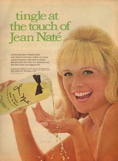
Throwback Thursday Jean Nate
It is Throwback Thursday at Elarbee Media and this Jean Nate ad screams summer. You can almost feel the sunshine coming off the page.
Of course you would want a refreshing tingling splash of Jean Nate to refresh you and keep you smelling great in the heat.
The photograph of the product being poured to splash is cooling just looking at it.
There is ad copy that no one will read past the headline, but it doesn't steal form the message of the image, and the placement of the product as the star is perfect. We think this is a win.
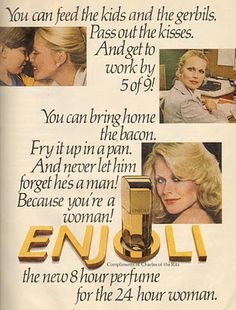
Throwback Thursday Enjoli
It is Throwback Thursday at Elarbee Media and today we've pulled out a classic ad campaign for your entertainment. "Enjoli. The 8 hour perfume for the 24 hour woman."
After all of these years, we can still sing the entire commercial and see an attractive blond swinging a frying pan In fact our offices have been filled with off-key renditions of it all day long.
In this case the TV campaign does not translate to print. This ad, although it advances the same claims, fails to create the same look or feel as the television spot it loosely copies. The disjointed images, and heavy copy just don't work.
Print sells a brand with an image that grabs your attention. Product, lifestyle, mascot or functionality are all fair place to focus; but, the story needs to speak through the images.
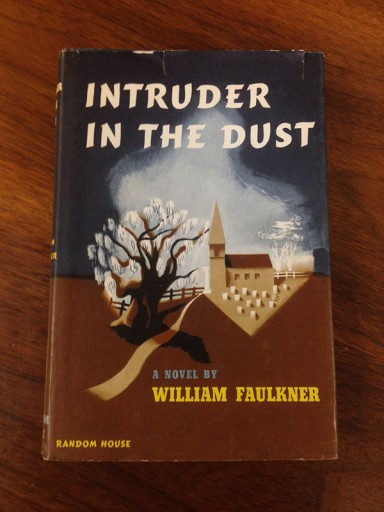
Throwback Thursday Faulkner Book Jacket
It is Throwback Thursday at Elarbee Media and we decided to highlight one of our many vintage book jackets. It could well have been a feature of our Art Tuesday post, but we chose to shake things up for Thursday and carry on our Faulkner theme.
Cover art for books is part of the sales packaging. Book jackets are functional, protecting the book, but they offer an opportunity to visually grab the attention of the buying public to lure them in to the purchase of a book. Titles are catchy, but can be misleading. Adding the visual trigger of the book jacket alludes to the book's content in a compelling manner.
Images are compelling. They also drive sales. In this case they also please the eye.
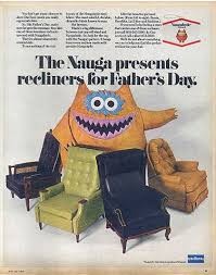
Throwback Thursday Naugahyde for Father's Day
This Throwback Thursday is all about Father's Day. That is Father's Day and Naugahyde. What Dad wouldn't want his old worn out chair reupholstered in Naugahyde? Especially a comfy recliner.
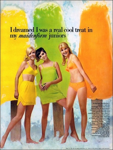
Throwback Thursday Maidenform Popsicles
It is Throwback Thursday at Elarbee Media and with all of the heat hitting the South, we couldn’t resist focusing on keeping cool. Well, sort of. Here is a vintage ad for Maidenform Juniors that does a fabulous job of tying in the color scheme of the new product line with a food item to match, but we can’t help feeling that the tie in of the underwear with the popsicles is a bit of a stretch for the “vintage” reader.
That said, we love the colors and the simplicity of the ad itself.
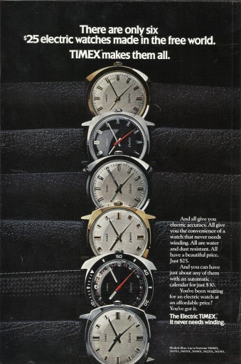
Throwback Thursday Timex
It is throwback Thursday at Elarbee Media! Our latest ad is for Timex. We love this ad for three reasons: 1. It conveys brand dominance in the market, 2. It has tremendous visual appeal, 3. I actually talks about the product and its benefits. Crazy concepts, and ones that people may want to try to employ in the modern era.
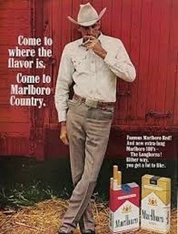
Throwback Thursday - Marlboro Man
It is Throwback Thursday at Elarbee Media. Today we are highlighting one of the most iconic advertising images, the Marlboro Man. Cigarettes are a controversial product these days, but what is undisputed in these campaigns is that they have built a brand icon. The Marlboro Man is an image of the rugged outdoor type, a man's man. Campaigns are image heavy, with extremely limited copy. What Marlboro and their agencies never fail to execute on is the product highlight.
There is a cowboy, there is a cigarette being smoked, and there are boxes of the product on display in the ad. Brilliant. What we like even more is that you can choose lights or regular, and still be the Cowboy.
Wit & Wisdom Wednesday on Cowboys
“Any cowboy can carry a tune. The trouble comes when he tries to unload it.” – Old West Proverb
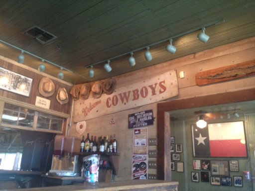
It is Wit & Wisdom Wednesday at Elarbee Media, and we are so excited to be once again in Texas! Cheers Cowboys!
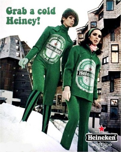
Throwback Thursday Grab a Cold Heiney!
It is Throwback Thursday again at Elarbee Media, and keeping on this week's theme of quotes we found a vintage 1960's ad from Heineken. We love the catch phrase "Grab a Heiney" and in this ad they even add the word cold and match the image to the edited phrase. LOVE it!
It is humorous, memorable and really would work as well today as it did in the 1960's.
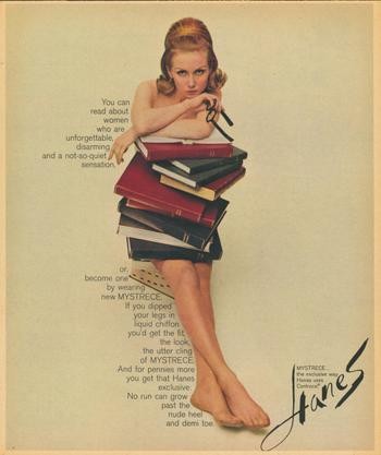
Throwback Thursday - Hanes Goes Brainy
It is Throwback Thursday at Elarbee Media. We happened across this vintage Hanes ad that we just love. A woman who reads books, a woman who wears glasses, a woman who is attractive and overtly sexual, and all of this is an ad to sell product to women. It is not demeaning, but it is SEXY. The imagery is superb, and the clean background allows the content to skim the body of the image to ad interest.
If you are not a fan of redheads, this ad campaign also features a brunette version and a blond.
Throwback Thursday Smirnoff Bra Burning
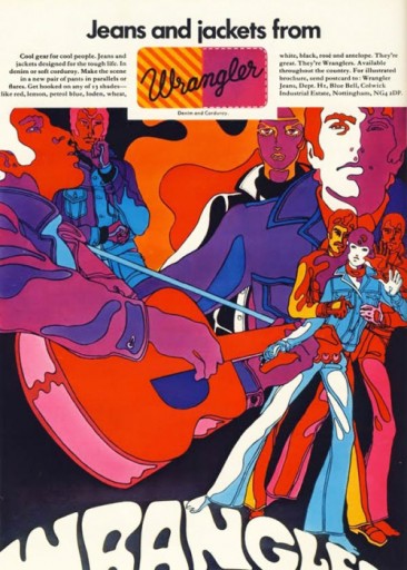
Throwback Thursday - Wrangler Goes Psychedelic
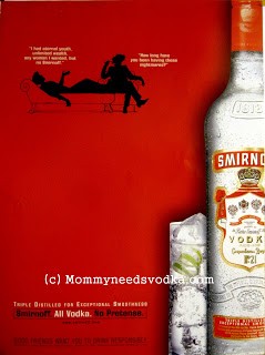
Throwback Thursday Smirnoff Circa 2000
It is Throwback Thursday at Elarbee Media. Here is a more recent throw back ad from Smirnoff Vodka circa 2000.
Why so modern you ask? This ad incorporates three of our favorite ad elements: Red, clean imagery and humor.
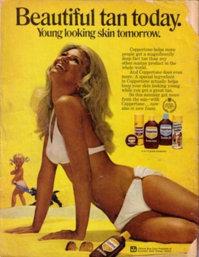
Throwback Thursday Coppertone Bikinis
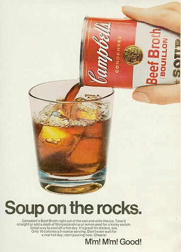
Throwback Thursday Campbell's on the Rocks
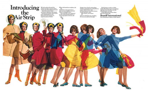
Throwback Thursday Braniff Air Strip
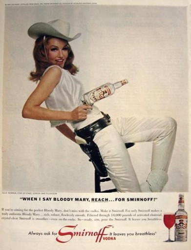
Throwback Thursday Smirnoff Ad with Julie Newmar
We love this vintage Smirnoff ad, complete with a cowboy hat! Why? It is image driven and clean, with limited distraction from what is being sold.
Plus it is Julie Newmar in a cowboy hat!
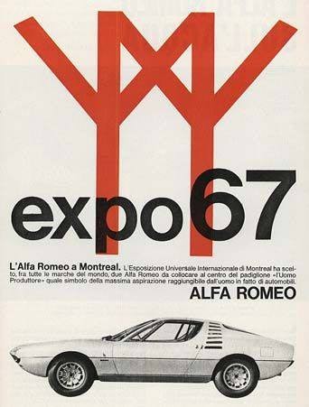
Throwback Thursday Alfa Romeo Ad for Montreal Expo
Yep we like it! Alfa Romero. 1967 EXPO. Montreal..
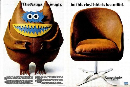
Throwback Thursday Naugahyde and Nauga
From a business perspective, this highlights the employment of both humor and storytelling in advertising. This is simple, clean, funny, and memorable. Having a "mascot" also makes it great for merchandising the brand.
After all, who wouldn't want their own Nauga?
Throwback Thursday Jim Beam and Sean Connery Ageless
Read this one closely. If you printed this today, all of this would still ring true. How about that for some awesome ad copy!
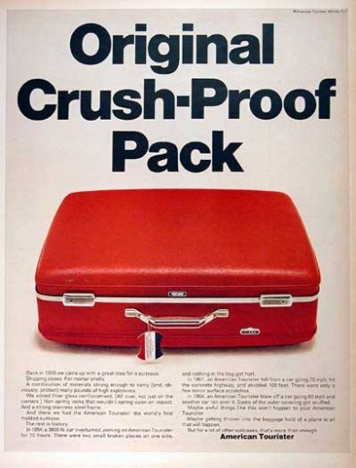
Throwback Thursday American Tourister Ad is Crush-Proof
It's Throwback Thursday at Elarbee Media. This 1968 American Tourister ad is the perfect example of clean simplicity with its use of color and graphic imagery. We love it!
They are selling a SUITCASE, and the functionality and features of......a SUITCASE. Shocking but true! Selling the benefits of a product actually works.
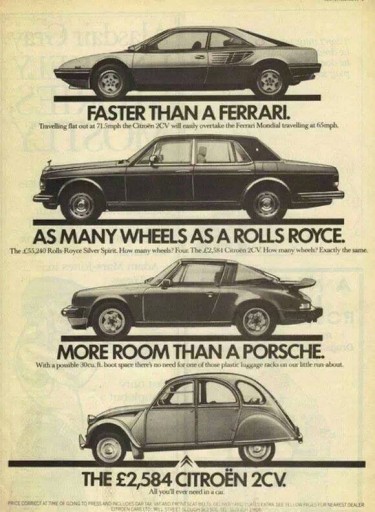
Throwback Thursday Citroen's Truth in Advertising
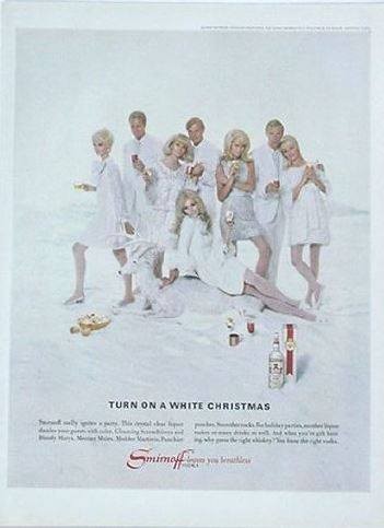
Throwback Thursday Smirnoff Ad White Christmas
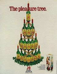
Throwback Thursday J&B Bottle Tree
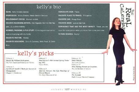
Throwback Thursday Kelly Elarbee
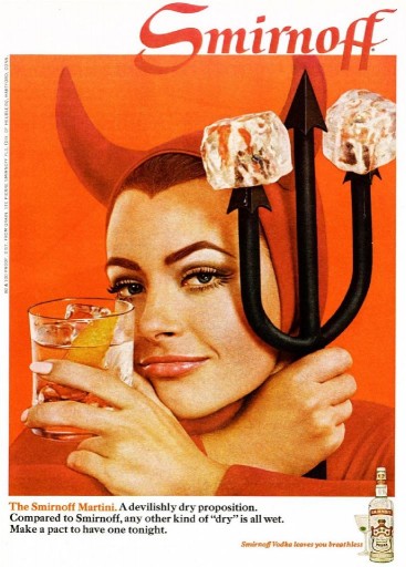
Throwback Thursday Smirnoff Halloween
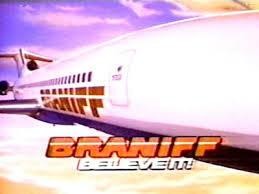
Throwback Thursday Braniff, Believe It!
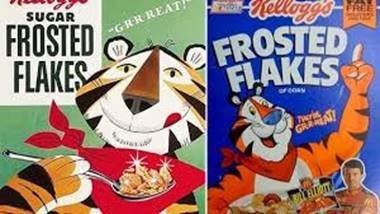
Throwback Thursday Tony the Tiger
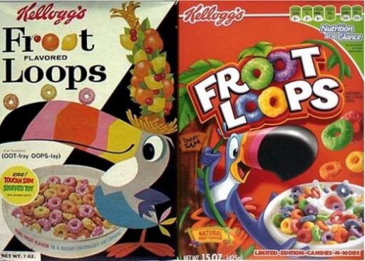
Throwback Thursday Froot Loops Imagery
Throwback Thursday Brand Iconography
Throwback Thursday Sexism in Advertising
Throwback Thursday Buzz Versus Product Focus in Ads
Throwback Thursday Direct Mail
Throwback Thursday Women and Computers
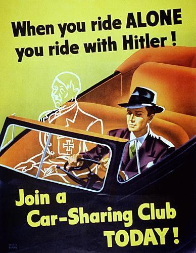
Throwback Thursday Driving with Hitler
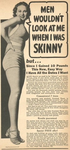
Throwback Thursday Too Skinny Ad
Throwback Thursday Celebrity Endorsements
But are celebrity endorsements still effective in today’s world? All signs point to yes... “Recent studies of hundreds of endorsements have indicated that sales for some brands increased up to 20% upon commencing an endorsement deal.” Check out this article to read more about celebrity endorsements →http://bit.ly/1dSfZIa


.jpg)
