-
 Let's Talk About Stuff.
Our Blog
Our goal in posting our blogs is three fold: To introduce timely industry news that is relevant to our clients; to post items we find interesting and entertaining, and finally, to give you a glimpse of TSW US “Behind the Curtain”. We take the business aspects of what we are doing very seriously, but we like to have fun, hopefully that shines through here.
Our Blog is a puzzle being assembled. Sometimes the individual pieces of the puzzle don’t look like the whole picture once completed – You have to keep adding pieces one at a time to make the image clear. We hope you keep coming back to see how the TSW US puzzle takes shape.
Happy Oktoberfest!
It’s the final day of Oktoberfest, a special time of year for Elarbee Media. We are sad to have to put away our Oktoberfest steins and our dirndls for another year. To our German clients colleagues and friends, we want to leave you with one final Prost! before we close it out.
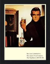
Throwback Thursday Sean Connery for Jim Beam
It is Throwback Thursday at Elarbee Media, and true to form, we are featuring a vintage print ad. We pick ads from the past that we rate as timeless or that are extremely timely to a period and no longer have relevance, but are very amusing. Today we are feeling timeless.
Today, we selected one of our favorite celebrity endorsements to highlight. Sean Connery for Jim Beam. This ad hits on all levels and if we put Sean Connery's updated photo with a beard in the same ad today it would sell many fifths during the holiday season.
Simple and clean. Image-heavy with limited copy. Definitely aspirational.
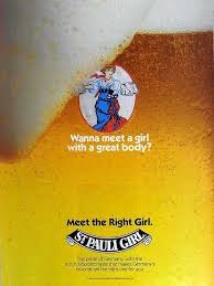
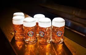
Throwback Thursday Oktoberfest St. Pauli Girl
In honor of Oktoberfest, we thought we would use Throwback Thursday to highlight some beer ads. This St. Pauli Girl ad is from 1990.
Simple, but witty. Creating a woman out of the beer is brilliant, and allows the consumer to indulge in a romance with the product. Silly and cunning all at the same time. We love it. The fact that the art execution is also clean and well done is a fine by us too.
Prost!
Art Tuesday - Color in Advertising
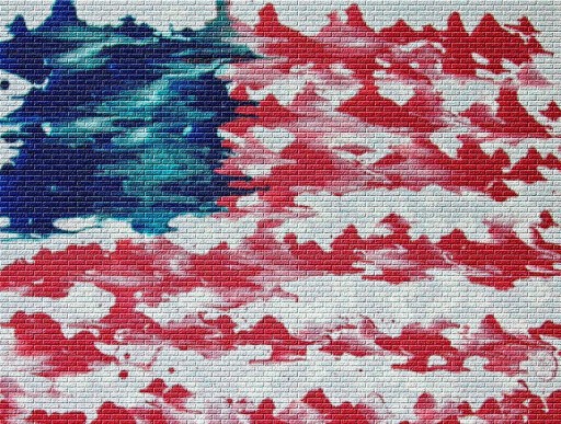
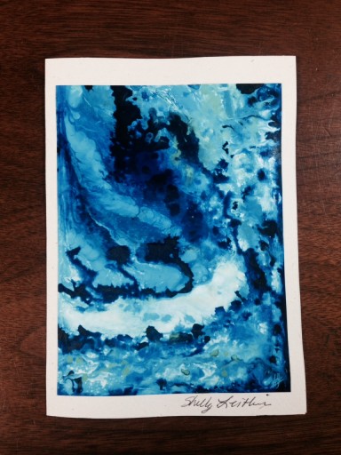
It is Art Tuesday at Elarbee Media and we want to talk about color. We know that in advertising darker colors like green and blue are used to convey the feeling of stability. Favorites of financial institutions these "cool" colors are often also defined as masculine.
So what happens when you combine these stable, masculine colors with chaotic pattern, or with the freedom of no pattern?
Is a lack of control executed in blue jarring, whereas a lack of control in red is anticipated?
We found this blue piece by Shelly Leitheiser to be so organic in its appeal that we simply did not care, Not normally buyers of Blue art, we threw caution to the wind. Sometimes you have to get out of your comfort zone.
For more on how color is used in advertising:
http://www.blurgroup.com/blogs/group/the-impact-of-colour-in-advertising-marketing-and-design/
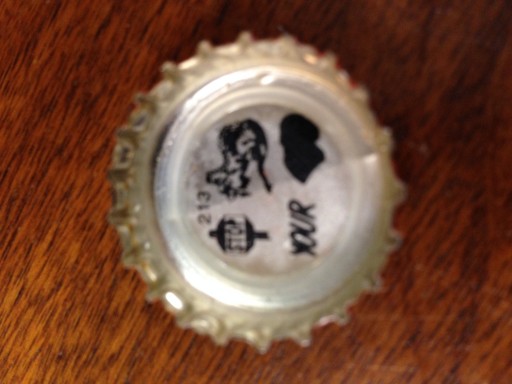
Cocktail Friday Lone Star Bottle Cap #213
It is Cocktail Friday at Elarbee Media, and we are closing shop early today to go our annual Pig Picken'. But we wanted to leave you with a brain teaser from Lone Start Beer before we left. Here is # 213.

Wit & Wisdom Wednesday - Yogi Berra
"It ain't over till it's over" Yogi Berra
It is Wit & Wisdom Wednesday at Elarbee Media, and today we want to highlight one of the best quotes ever. Keep pushing forward in business and in life. There is a reward.
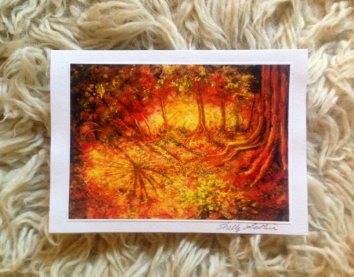
Autumnal Equinox Fall Leaves
Today is the Autumnal equinox. The equinox occurs the moment the Sun crosses the celestial equator from north to south.
In honor of the Autumnal equinox we thought we would highlight a piece of seasonal artwork that we recently purchased. This rust and orange clearing in the trees is by Shelly Leithesiser. We think it captures the feel of Autumn perfectly filled with vibrant color, and still clinging to the warmth and light of summer.
leitworks.com

Wit & Wisdom Wednesday - Franklin on Diligence
It is Wit & Wisdom Wednesday at Elarbee Media and we can always count on Ben Franklin for a dose of truth. In business, sitting back and waiting doesn't make the phones ring or the money roll in. Small steps toward your long term goals create steady progress.
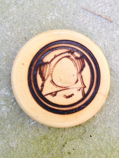
Art Tuesday Urbnpop Wood Burning
It is Art Tuesday at Elarbee Media and today we are excited to show you our newest addition from URBNPOP. This adorable horned and helmeted monster is a magnet. We haven't seen wood burning outside of the rustic country arena in so many years we were surprised when we encountered it here.
The combination of the wood burning with the monster subject matter strikes us as just wrong enough to be perfectly right!
Often the "off-kilter" is striking, and memorable. You don't have to scream to be heard. Sometimes you just have to whisper and be a little cheeky.
Cheers URBNPOP! Thanks for the gift. Urbnpop.com